The Consequence Table
A consequence table is a summary matrix illustrating the performance of each alternative on each objective. It is like an executive summary of the relative performance of the alternatives – it presents the key messages about the trade-offs and uncertainties relevant for decision making.
Importantly, there will normally be supporting information about every cell in the table. This information will help participants put that number or summary statement in context, including understanding what’s included and not, the significance of differences across the alternatives, and whether and how uncertainty affects the interpretation of results. The back-up information should provide participants with confidence that the performance expressed in the consequence table is in fact a good summary of how that alternative performs relative to others.
A consequence table can take a variety of forms depending on the complexity of the problem, the stage of analysis, and/or the depth of analysis that is possible with the resources available.
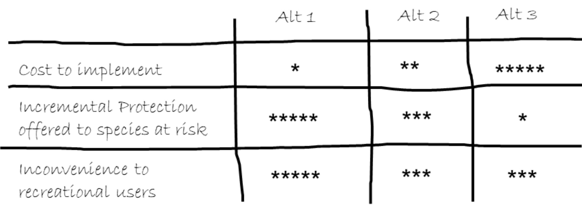
A simple, qualitative consequence table may just use a simple rating (such as a 5-star rating) to describe the performance of each alternative. In the example below, one star (*) represents the alternative that performs worst with respect to an objective (e.g., Alternative 1 is the most expensive), and 5 stars (*****) represents the best performing alternative (e.g., Alternative 1 offers the most incremental protection to a species at risk.)
* = Worst performing alternative and ***** = Best performing alternative (click to enlarge)
Simple consequence tables can be very useful at the scoping stages of a decision, where they can help a group build a shared understanding of the scope and frame of the decision, and highlight expected trade-offs and uncertainties that will need to be explored in more detail. In some decisions, this level of qualitative analysis may be all that is needed (in simpler, low-stakes decisions) or all that is possible (when time or budget are limiting).
There are obvious shortcomings with this level of analysis, however. Among these are:
- It provides no sense of how important the difference is between one star and five stars (e.g., what difference in actual protection is offered by “*****” relative to “*”?)
- The assignment of scores or stars may lack rigor, be conducted by people without the appropriate expertise, and be subject to a range of common cognitive errors and biases [link to another web resource, maybe?].
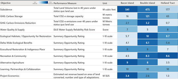
Because of these and other problems, a more complex consequence table with a mix of quantitative and qualitative entries is often appropriate. A range of colour-coding techniques offered by programs such as Microsoft Excel or AltaViz Lite can be used to highlight the trade-offs. The table below summarizes the relative performance of several candidate islands in a decision that involved selecting which island offers the best opportunity for landscape-scale restoration in response to subsidence. Each Summary Opportunity Rating involved developing a 10-point constructed scale to ensure consistency in scoring and interpretation.